Playful, not childish.
Keep the approachable energy of labels and stickers without turning the brand into a toy-like SaaS identity.
A brand for the everyday reality of ecommerce. Clear enough to explain a product. Distinctive enough to build a world around it.

Avalia helps ecommerce businesses collect and show customer reviews. The brand needs to make trust feel concrete, not abstract.
The visual language draws from the world those businesses already know: packaging, labels, receipts and the practical details of a working store.
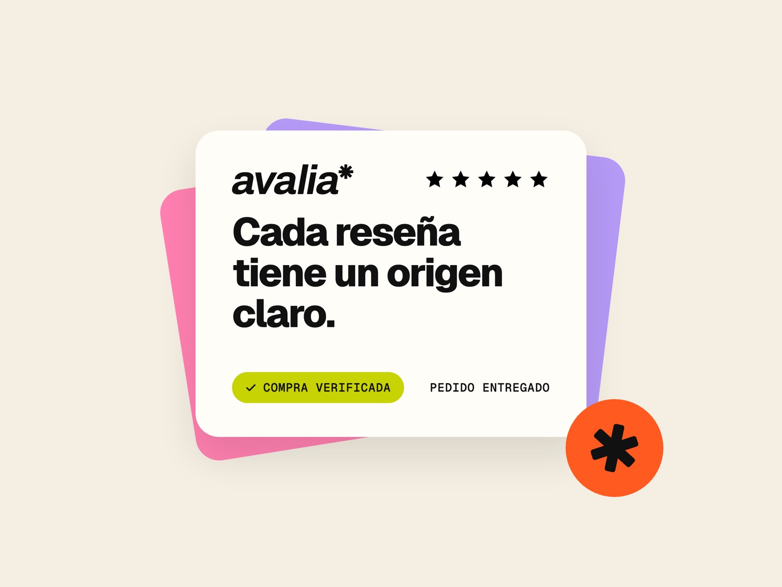
Key visual: a verified review built from the system’s labels, color and type.
The starting point was an existing wordmark worth protecting. The exploration focused on the world around it: fruit-sticker energy, everyday commerce objects and a playful visual language that still felt credible.
Same recognizable identity.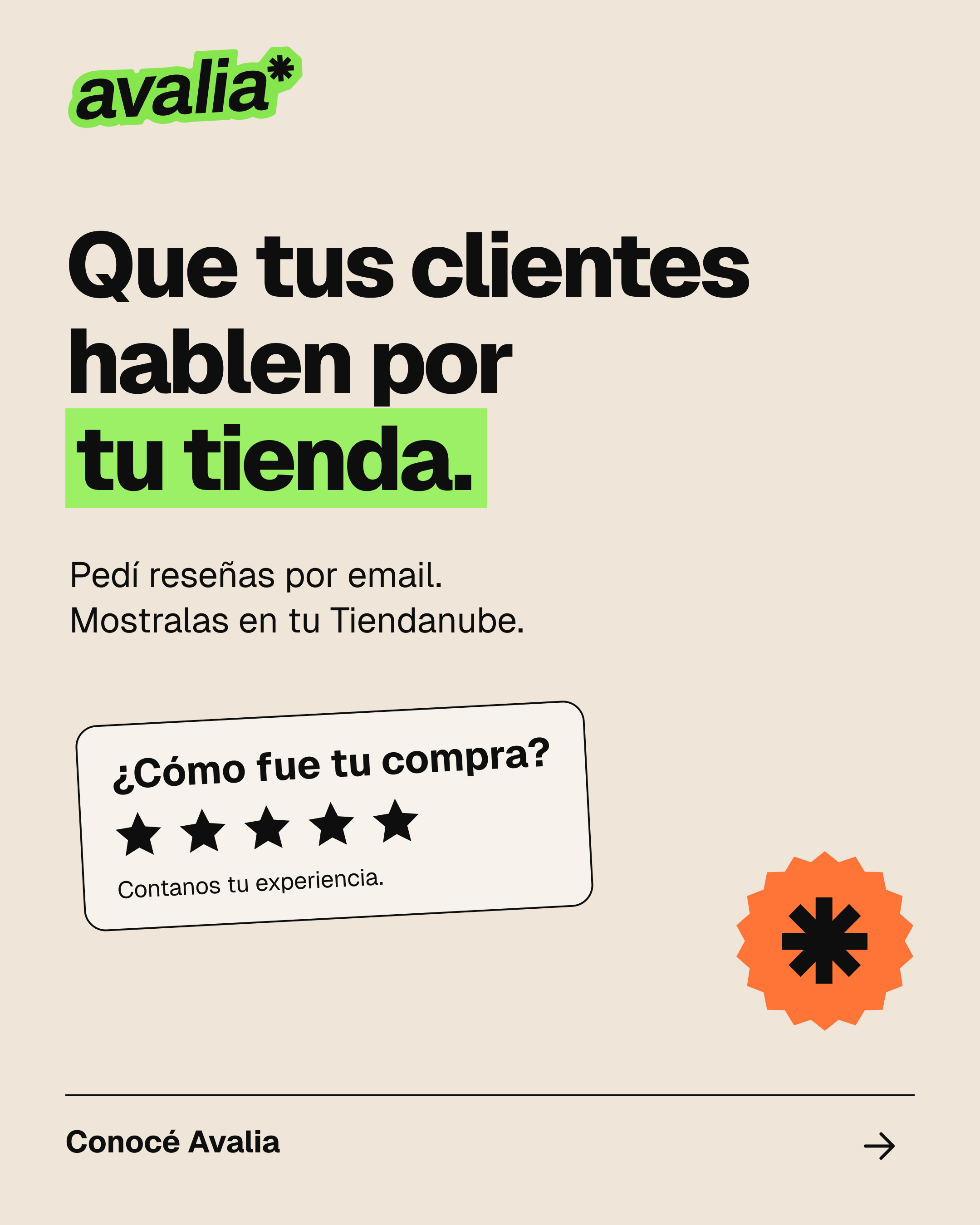
 Identity.
Keep the approachable energy of labels and stickers without turning the brand into a toy-like SaaS identity.
Move from rough paper and cardboard toward cleaner shapes, brighter neutrals and more deliberate contrast.
Give type, color and labels clear jobs so the identity can travel across web, packaging concepts and communications.
A wordmark, a label treatment and a compact symbol carry the identity across different scales. The artwork stays recognizable while the format changes.
Three existing identity formats, shown together as a flexible family.
Soft, tactile neutrals anchor the system. Brighter colors give messages and operational details their own space without making everything compete.
Core colors from the consolidated Avalia identity guide v0.2.
The consolidated identity guide pairs Geist for expressive, direct headlines and readable text with Geist Mono for smaller operational labels.
Aa Bb Cc Dd Ee Ff Gg Hh Ii Jj Kk Ll Mm
0123456789 · ! ? & @ *
Geist and Geist Mono, specified in the consolidated identity guide. Upright type, with italic reserved for the original wordmark.
Rounded, consistent icons help people scan the product story. The functional set supports the brand’s own wordmark and symbol without competing with them.
Functional icons from Lucide, applied within the brand system.
Product explanation becomes a series of clear, visual moments. Labels, receipt-like cards and color connect the message to familiar commerce objects.
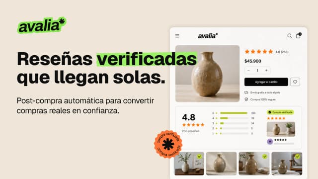
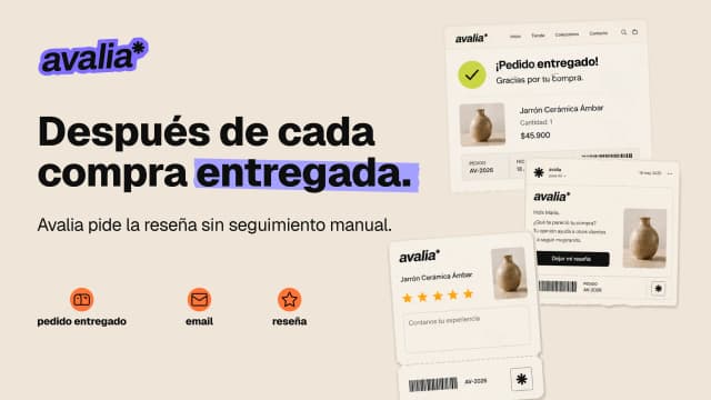
Published marketplace applications.
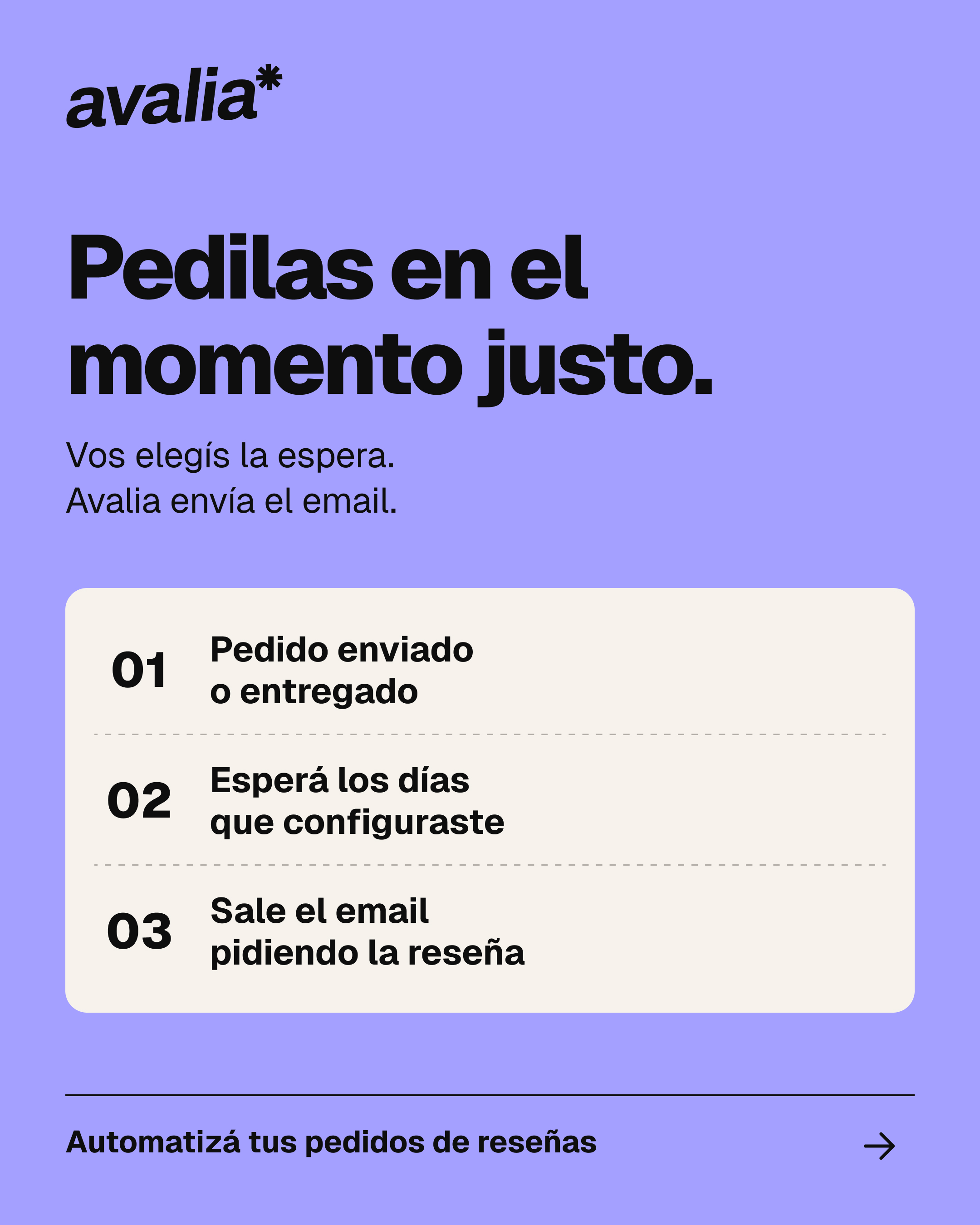
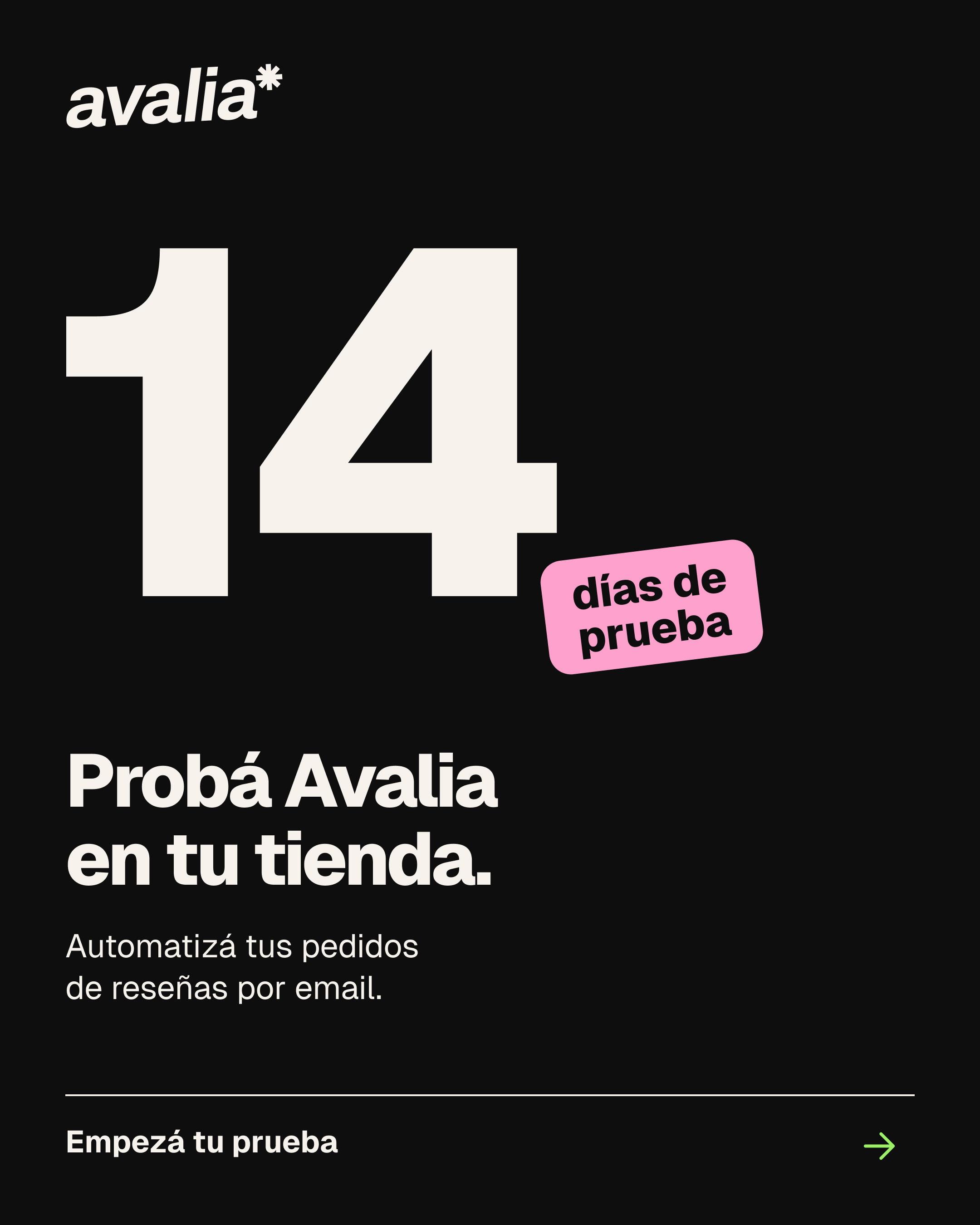
The same identity moves into social: bold hierarchy, purposeful color, simple product language and familiar label devices. Three published applications show how the system handles different messages.
Published on Avalia’s Instagram, October 2026.
Story layouts adapt the same system to short explanations: one message, a strong typographic focal point and enough room for the practical details.
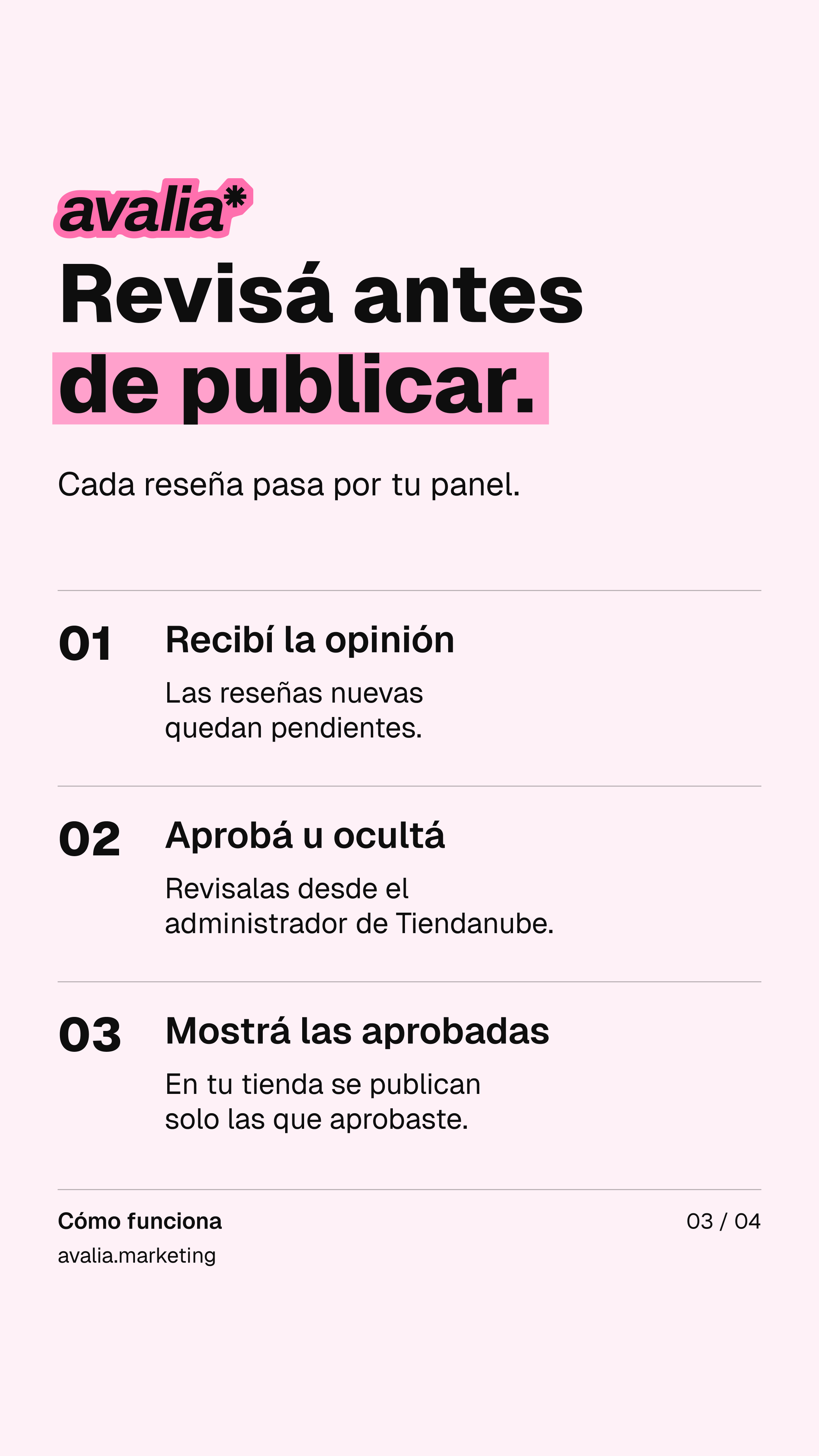
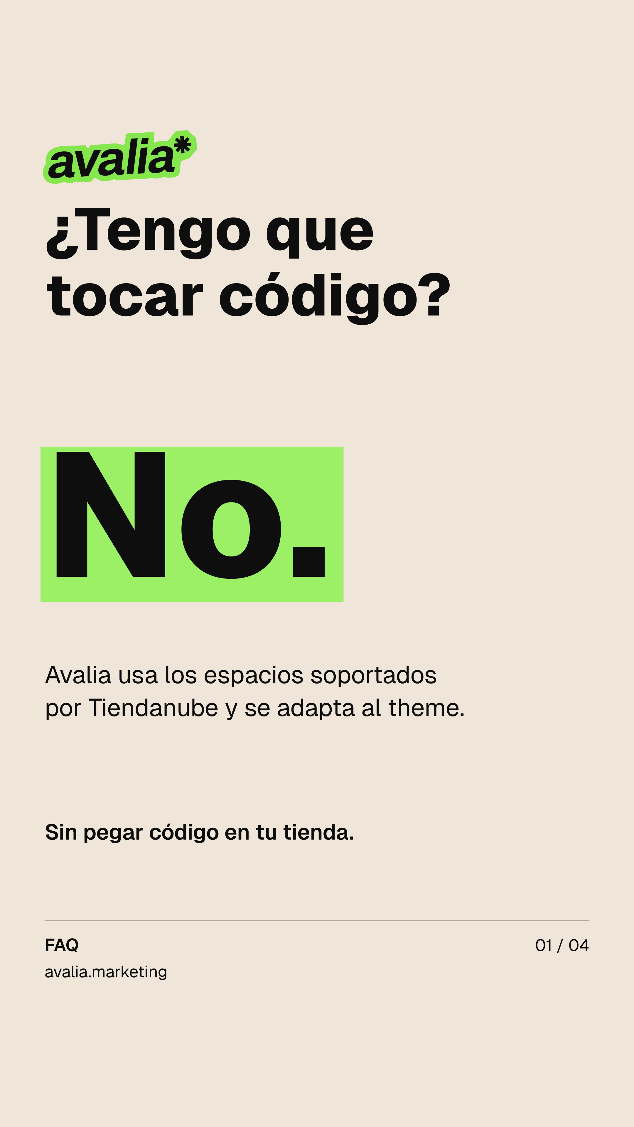
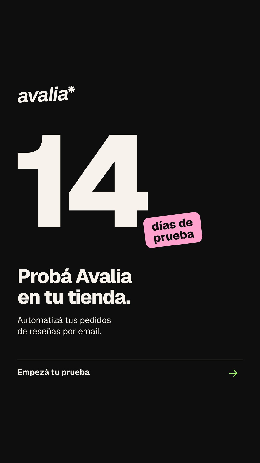
Story and post layouts from the same system.
A short product story designed to remain understandable without audio. Text-led scenes keep the message legible while motion adds sequence and emphasis.
Reseñas reales para tu TiendanubeWatch the product film on YouTube ↗Published product demo.
This case focuses on Avalia’s brand identity and creative direction, with published applications produced collaboratively.
Explore Avalia in context ↗